Culture
When Beauty Offends: Art Censorship and the Fear of the Body
18 June 2026
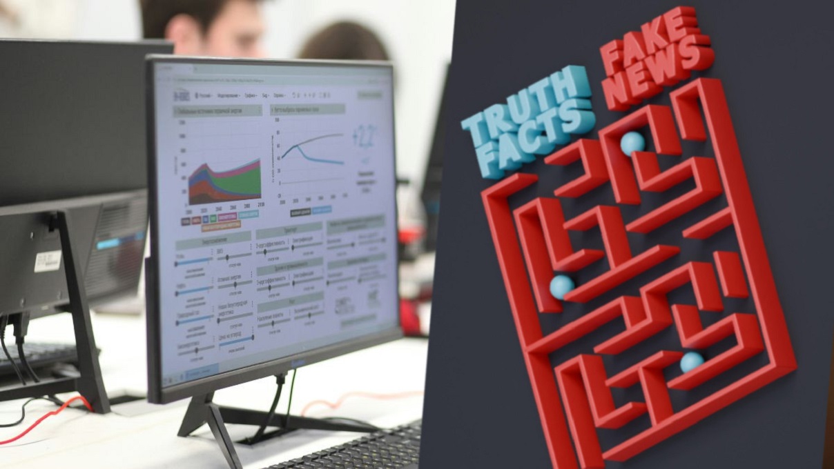
In this era of pervasive misinformation, we often expose ourselves to danger without realizing it. New research from MIT reveals that our perception of a chart’s truthfulness and the author’s intentions are swayed by a psychological mechanism: we believe the graph's appearance, not the underlying data. Researchers warn this is a serious problem, underscoring the powerful role of visuals in disinformation.
New research from MIT suggests that persuasive communication works on multiple levels. When a chart pops up on your social media feed, you often don’t even scrutinize the data. Before you start reading the numbers, you are already subconsciously judging: “That looks like something created by a right-winger,” or “That style reminds me of the left.” Based on that initial impression and your own views, you decide whether the chart is credible.
This isn’t a flaw in thinking, but rather a newly described layer of visual communication, which the MIT team recently detailed in a series of studies. “We showed that visualizations convey more than just the data itself. They also communicate social signals,” explains Arvind Satyanarayan, co-author of the work presented at the IEEE Visualization conference.
The researchers interviewed users of the Tumblr platform and conducted surveys with a broader group of respondents. They showed them charts—both in their original form and with the text, title, and axis labels removed. The effect was intriguing.
In both cases, participants formulated detailed assessments. Based solely on the chart’s appearance, they speculated that someone posted it on Instagram or Reddit, suggested it was likely created by a “conservative boomer,” or perceived it as a corporate presentation. This readiness to pass judgment, according to the scientists, says a lot about our low resistance to misinformation.
“If you’re scrolling through social media and you instantly dismiss a chart as something created by an influencer for attention, that shapes your entire experience—before you even dive into the data,” emphasizes Satyanarayan. So, what factors influence our opinion about a graph? The researchers investigated that, too.
Key design elements proved crucial: the color palette, the font choice, and the overall graphics quality. One study participant instantly formed a strong opinion about the authorship of a graph just by seeing a chart featuring the flags of Georgia and Texas and a red-and-black color scheme.
Though the chart lacked any text, the respondent declared, “That looks like something a Texas Republican would put on Twitter.” The mere visual style was enough for the recipient to estimate the sender’s political views and origin. They even guessed the platform where the chart supposedly appeared.
Interestingly, these intuitive assessments did not depend on the participant’s level of education or their data literacy skills.
“It’s not a mistake that people draw these conclusions. It requires a great deal of cultural knowledge about where data visualizations come from, how they are made, and how they are distributed. Drawing conclusions is a feature, not a bug, of how we use signs,” notes Graham M. Jones, an anthropologist at MIT.
The researchers even created a typology of specific associations. Charts deemed “too beautiful” raised suspicions of advertising manipulation. Conversely, graphics designed in a “default Word settings” style were perceived as honest, albeit amateurish. “If something is so pretty that you can tell a graphic designer approved by the marketing department made it, they are trying to sell you something,” explained one respondent.
In subsequent studies, the researchers examined what influences trust in a chart. It turned out that the sheer aesthetics of the design were less significant than the author’s presumed intentions and the values they represent. A statistical model showed the most important factors were the perceived goal of the communication (to inform or to manipulate), the perceived competence of the creator, and—crucially—whether the recipient felt the author “was on their side.”
“In our best model, the ‘intention’ variable explained 38% of the variance in trust, while ‘beauty’ only explained 13%,” the study authors write.
Michelle Morgenstern, a co-author of the research, warns that in an era of polarization and anti-science movements, this finding has deep consequences regarding the spread of misinformation. “If the color scheme and layout of a chart suggest it was created by someone from ‘the other side,’ the recipient might reject even true data,” the researcher claims. She explains, “Simply engaging with it would be an act of betrayal against one’s own identity.”
Does this mean that scientists should now design their charts to appeal to specific audiences? The MIT team does not offer easy solutions but urges: Ignoring this invisible layer of communication is a risk that modern science cannot afford to take, especially regarding visuals in disinformation.
Read this article in Polish: Kłamstwa sprzedaje się grafiką. Przekonują nas wykresy, a nie dane


A journalist and a graduate of Jagiellonian University. He gained experience in radio and online media. He has dozens of publications on new technologies and space exploration. He is interested in modern energy. A lover of Italian cuisine, especially pasta in every form.


Zmień tryb na ciemny